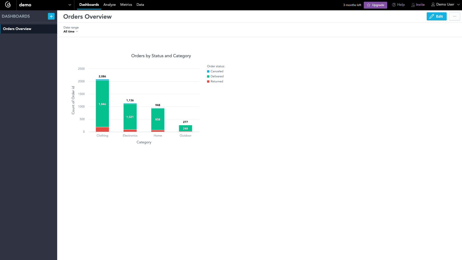
Create a Dashboard with Visualizations
A dashboard helps you summarize information on various aspects of your data. You can add visualizations to your dashboard and then embed it into any application if you want to present it to stakeholders.
Steps:
Open the
demoworkspace.Click the Dashboards tab.
The introduction page opens.
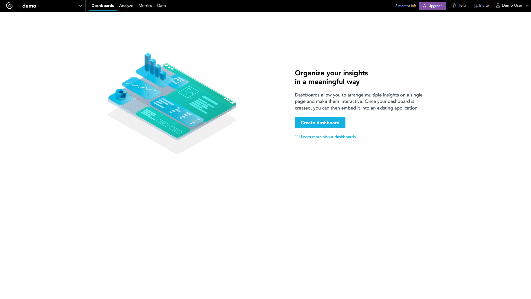
Click Create dashboard.
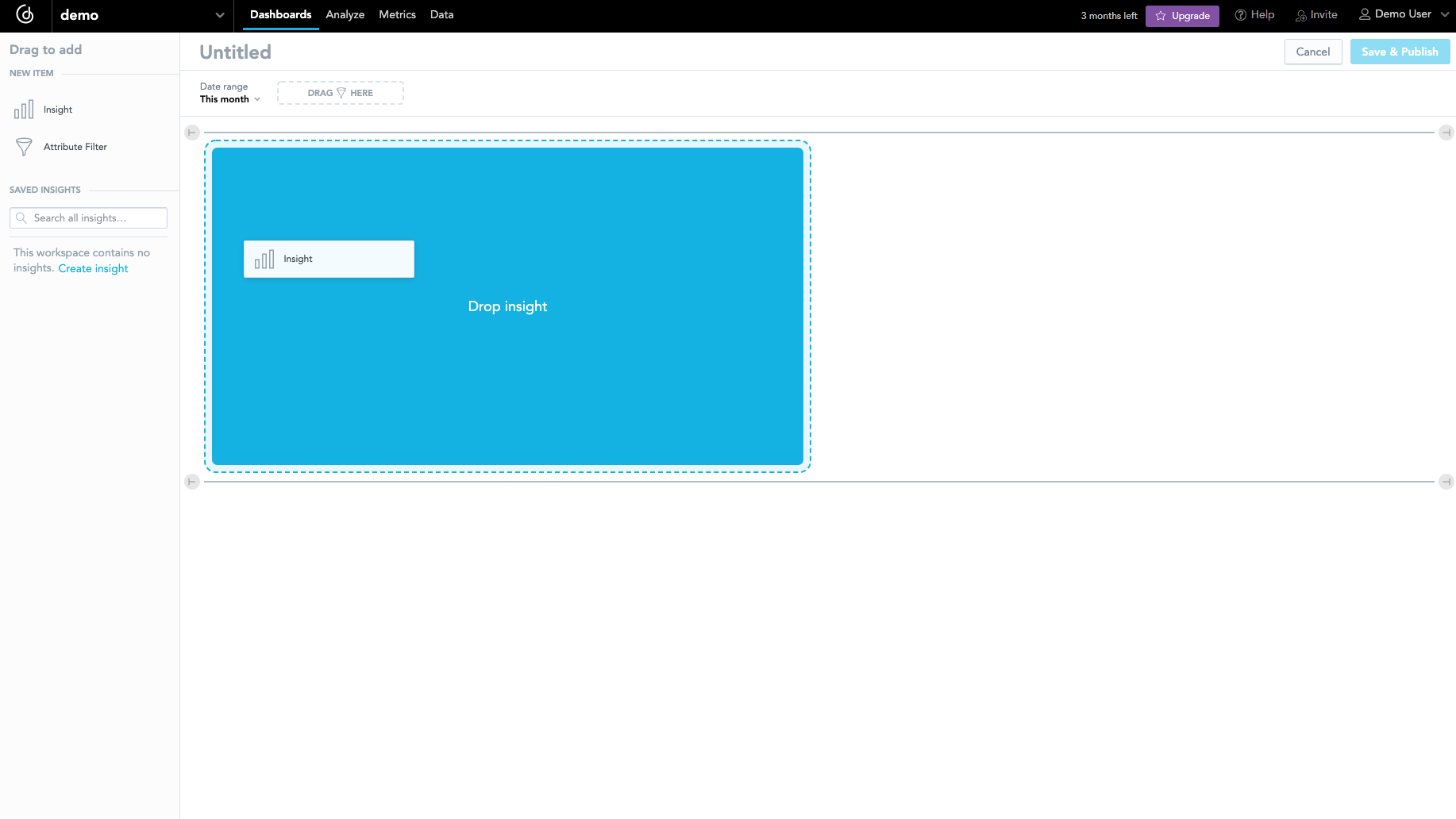
A blank canvas area representing an empty dashboard opens.
To start creating your first visualization, drag a Visualization from the left panel and drop it in the blank canvas area.
Analytical Designer opens in an overlay.
Analytical Designer is a GoodData tool for data discovery and visualization. For more information, see the Discover and Visualize Your Data section.The catalog is then populated with all entities from the LDM and organized in groups. An empty visualization view is in the center.
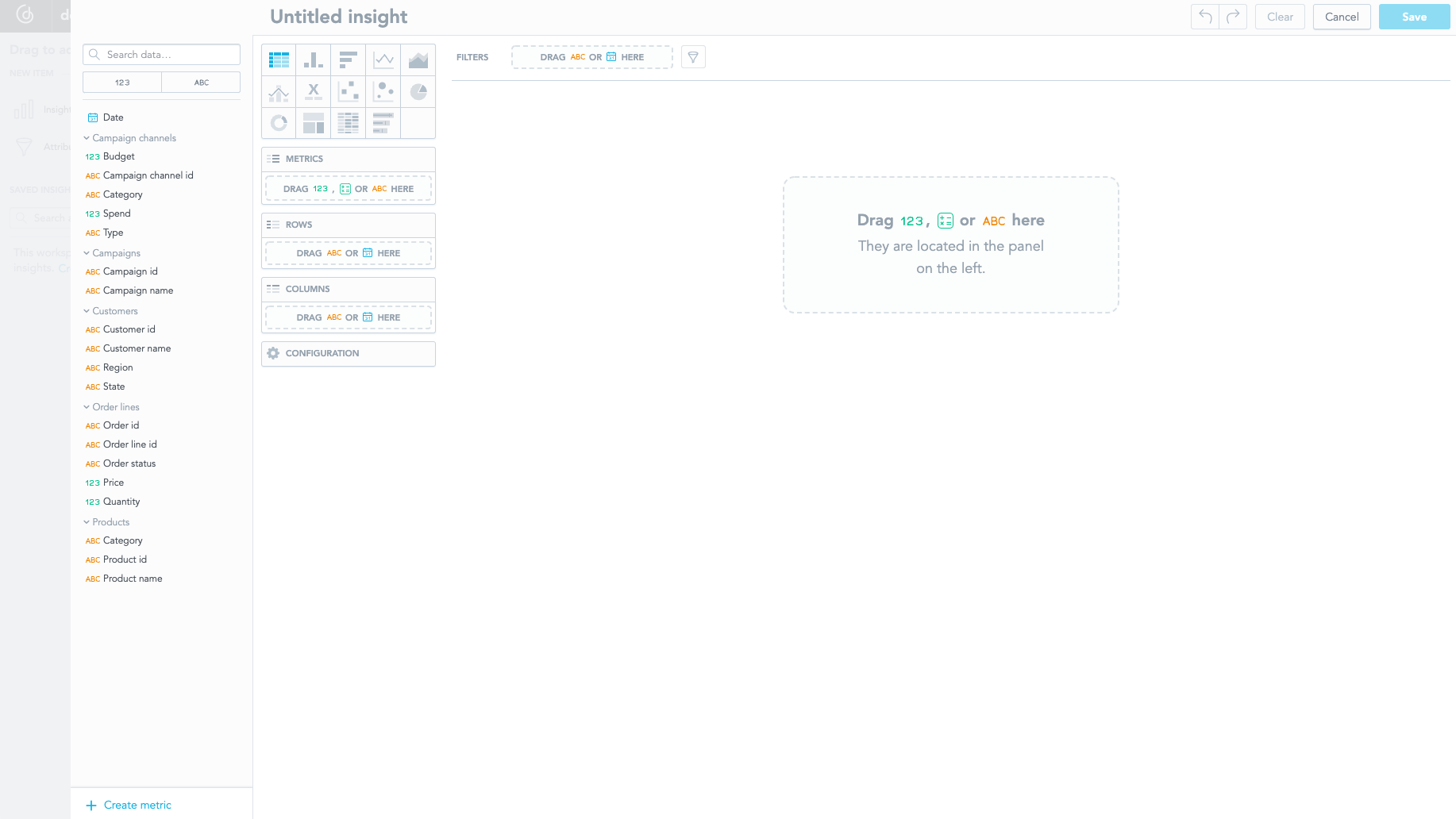
Click the Column Chart icon:
Drag and drop the
Order idattribute (under theOrder linesgroup) onto the Metrics panel.This automatically creates
Count of Order idin the visualization. Analytical Designer applied theCountfunction because theOrder idcolumn represents an attribute with a label, not a numerical fact.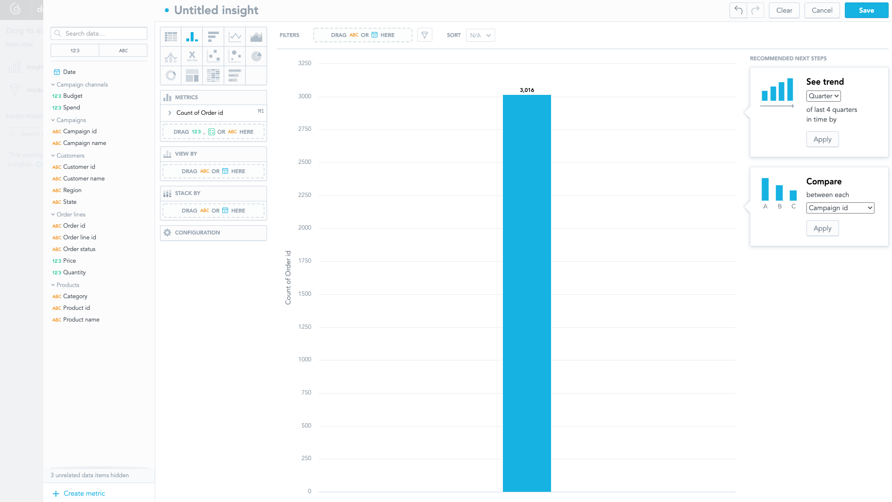
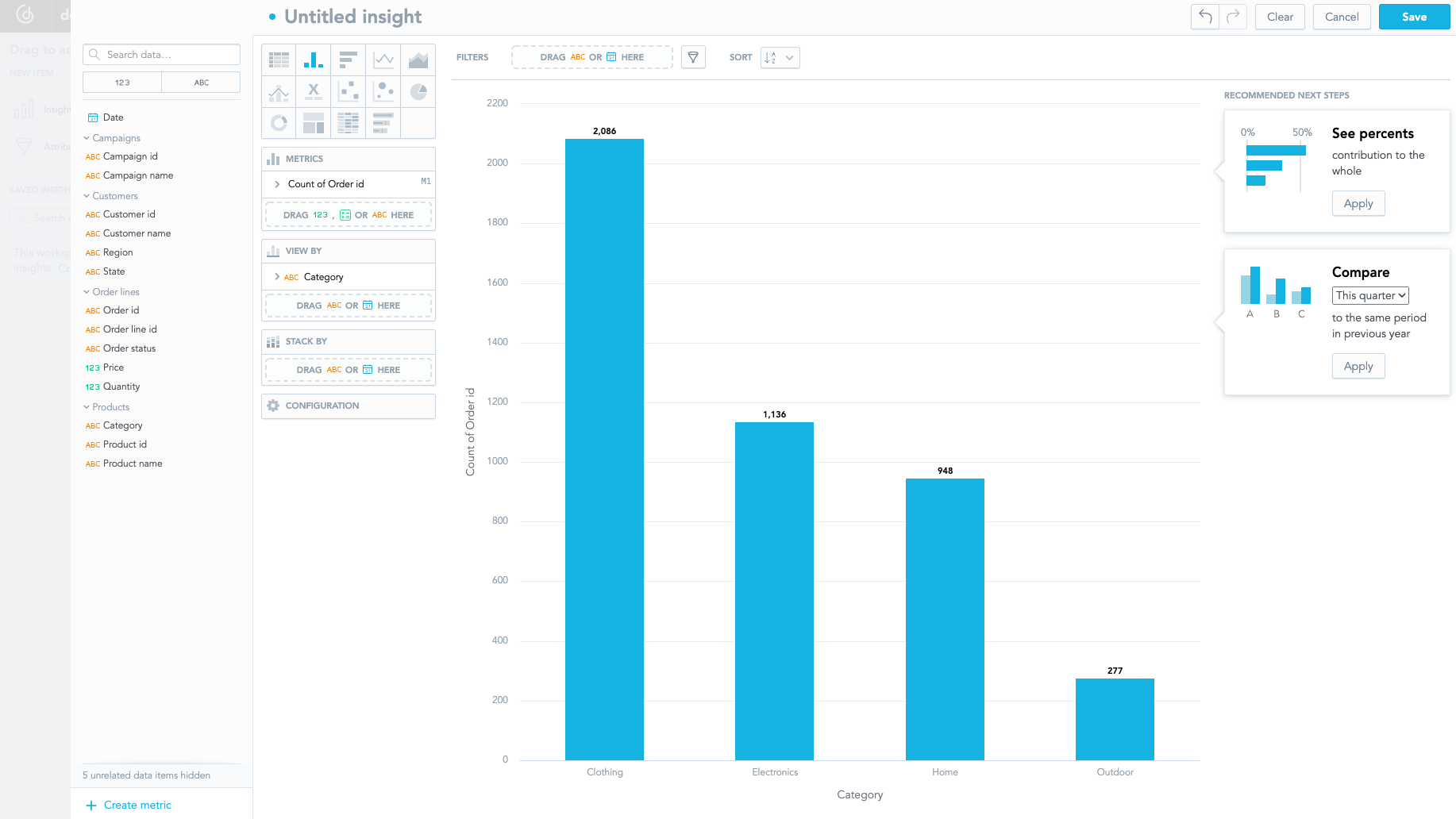
Drag and drop the
Categoryattribute (under theProductsgroup) onto the View By panel.The number of the orders is now split by the product category.
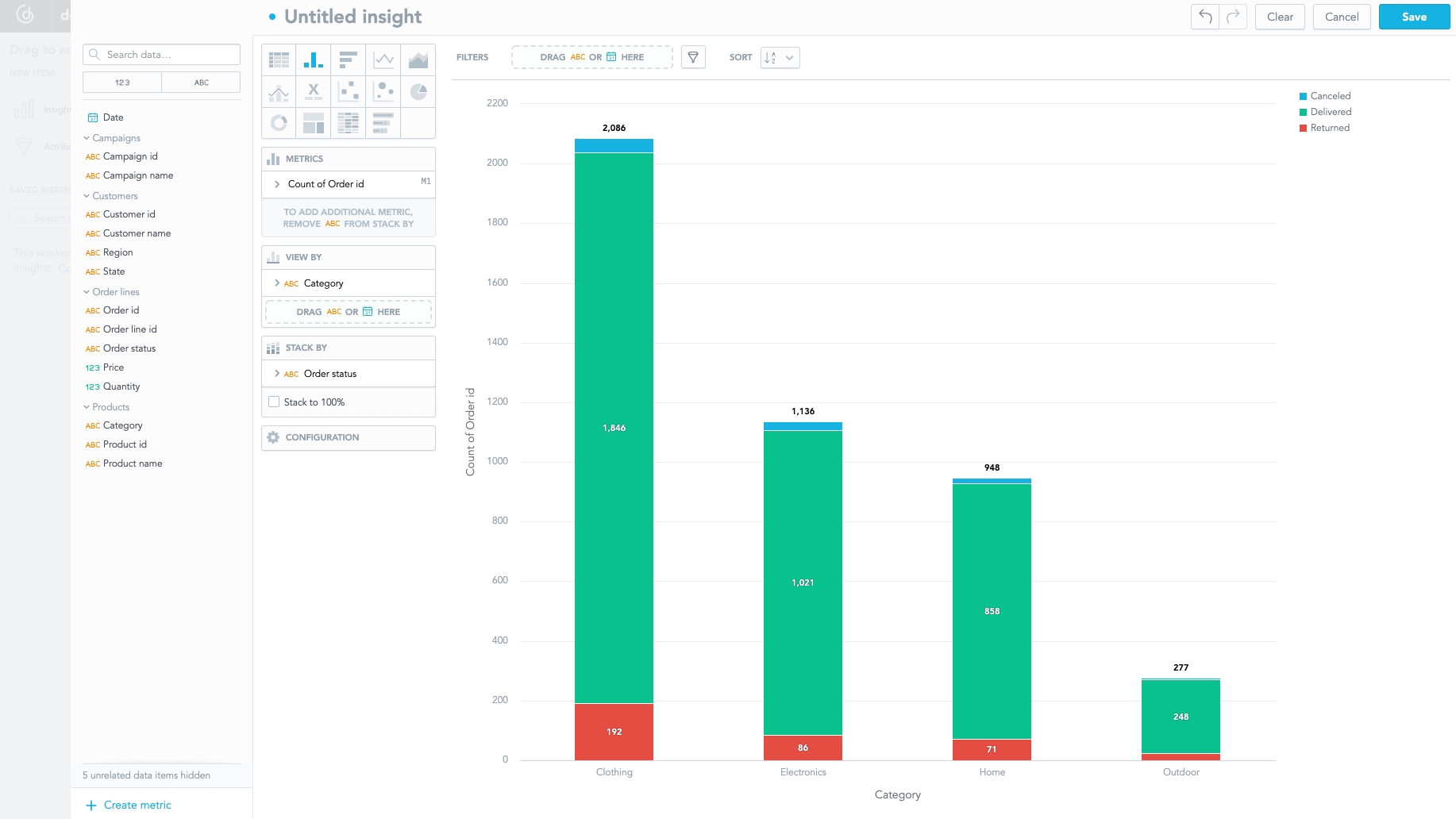
Drag and drop the
Order statusattribute (under theOrder linesdataset) onto the Stack By panel to look into the data in more detail.The columns are now further split by the status of the orders.
Click Save in the top right corner to save the visualization.
Name the visualization
Orders by Status and Category.You are returned to the dashboard view. In the left panel, you can see the list of saved visualizations.
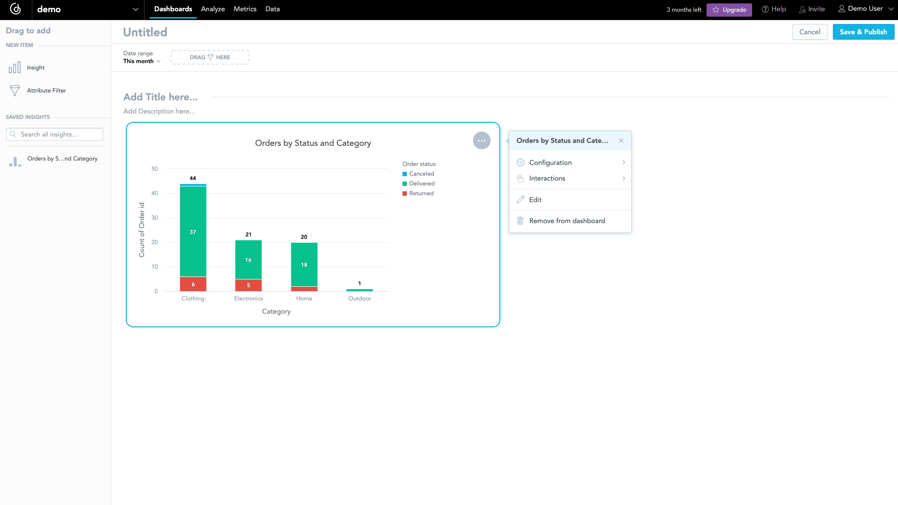
Set the value of the
Date rangefilter in the top panel toAll time.Name the dashboard
Orders Overview, and click Save & Publish.